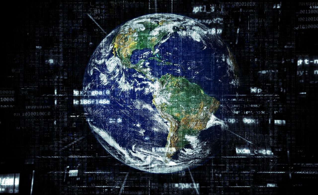
Map of the Internet
Map of the Internet is a 3D visualization of all the networks worldwide that are interconnected to form the Internet. The map shows ISPs, Internet exchange points, universities, and other organizations that route traffic online.
Explore the structure of the Internet:
• Zoom and pan to enlarge or rotate the map in 3D
• Tap on nodes to learn more about them
• Browse historical data and events that shaped the Internet
• Search for companies or domains you’re interested in
• Change views to see geographic or hierarchical maps
“This fascinating app represents the Internet and highlights its different aspects.” – CNNMoney
“The Map of the Internet app gets a Gearhead rating of 5 out of 5! Outstanding!” – Network World
“It is a beautiful way to show someone what the internet looks like.” – GigaOm
“Fantastic and beautiful” – Gizmodo
Both tablets and phones are supported.
The map of the Internet
Like any other map, The Internet map is a scheme displaying objects’ relative position; but unlike real maps (e.g. the map of the Earth) or virtual maps (e.g. the map of Mordor), the objects shown on it are not aligned on a surface. Mathematically speaking, The Internet map is a bi-dimensional presentation of links between websites on the Internet. Every site is a circle on the map, and its size is determined by website traffic, the larger the amount of traffic, the bigger the circle. Users’ switching between websites forms links, and the stronger the link, the closer the websites tend to arrange themselves to each other.
Charges and springs
To draw an analogy from classical physics, one may say that websites are electrically charged bodies, while links between them are springs. Springs pull similar websites together, and the charge does not let the bodies adjoin and pushes websites apart if there is no link between them. Originally, all such electrified bodies (websites) are randomly scattered on the surface of the map. Springs are stretched, repulsion energy is high – the system is far from being at equilibrium. Then the websites start moving under the influence of the forces exerted and in a while come to a halt – forces of attraction now become equal to forces of repulsion, the system has reached its equilibrium. It is exactly that state that is shown on The Internet map.
Also, an analogy can be drawn from quantum physics. In this case, a website is a physical body with a finite mass, a single user is the mass quantum – the much-spoken-about, yet-to-be-found Higgs’ boson (NB: was found in 2012), whereas the act of user’s switching between sites is the gravitational quantum – the graviton, another hypothetical particle.
Anyway, the real algorithm of plotting The Internet map is quite far from the analogies given above. For those interested, the closest description of the mathematical model can be found in the research [1], and the engineering solution looks very similar to what has been described in [2]. Google Maps engine has been used as the platform for displaying.
[embedyt] https://www.youtube.com/watch?v=Cmv1ABXNMtk[/embedyt]